|
Volatility, Fear, and
Despair ... What is the VIX (Volatility Index)
saying now?
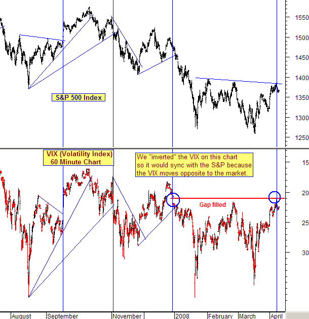
Below is our
daily VIX (Volatility Index) chart on a 60
minute incremental basis going back to last
March.
But first, before we go to the actual VIX
chart today, we will explain what the VIX-Volatility
Index actually is.
The VIX
explained:
Few really know what the Volatility Index
is or how it is calculated. Here's a brief
explanation ...
The Volatility Index (or VIX) is a
weighted measure of the implied
volatility for real time $SPX put
and call options. The puts and
calls are weighted according to time
remaining and the degree to which they
are in or out of the money. From this is
created a hypothetical at-the-money option
with a 30 day expiration time period. In this
way, they are trying to set a value that is
equal to the equivalent value of the $SPX's
current price. (When a stock's option strike
price is "at the money", it is theoretically
the same as the price the stock is trading for
at that moment.)
So what does that mean? It means that the
VIX really represents the "implied volatility"
for the hypothetical $SPX put/call options on
an "at the money" option value.
Still confused?
It all has to do with perceived risks. The
greater the perceived risks that are in
stocks, the higher the "implied volatility".
Implied volatility is about the perceived risk
in the stock market at a given point in time,
and NOT about the size of price swings in the
market.
In layman's terms
... how does this work?
It is actually quite simple. When the
stock market falls, there is an increased
demand for put options. Increased demand for
puts means higher put prices and that
generates higher implied volatilities. (Lower
demand for puts means lower put prices and
that generates lower implied volatilities.)
What else do you
need to know?
Only that the VIX moves in an inverse
relationship to the stock market. When the
VIX moves up, the market moves down. When the
VIX moves down, the market moves up.
____________________________________________
Now, let's move on to
today's VIX chart vs. the S&P 500.
This month, the
Volatility Index has itself been showing
its own volatility. A quick look at
the boxed in area on today's chart shows the
extreme and unprecedented high/low swings.
Yesterday, the
S&P had previously broken below below its
triangular support and was moving down to its
last support which was the previous price
low. That means there is only one support
left that has to hold now, or more short term
down action will occur.
Now, let's
look at the Volatility Index indicator at the
bottom of the chart. Two things are apparent
...
One: The
high/low swings in the boxed in area are
extreme. From a put option standpoint, this
is implying great investor uncertainty
as put buying increases sharply and then
decreases sharply.
Two: The
action of the VIX is showing higher/highs and
higher/lows. That is the classic definition
of an up trend. So, the VIX has been trending
higher, which means that after every round of
put buying and selling, the next round is one
of "greater" uncertainty by investors.
Many investors
are anxious for an upside rally in the
markets. We have had several attempts but none
of them have held.
What will the VIX need to
show for a Bear Market rally to start and
hold?
The answer is
that we will need a trend reversal to happen
on the VIX ... in other words, when it starts
to make lower/highs and lower/lows. Until
then, don't try to catch a falling knife.
*** Feel free to share this
page with others by using the "Send this Page
to a Friend" link below.
________________________________________________
Do you have a
friend or fellow investor that you think
would appreciate receiving a link to this
page of Today's Analysis"?
If so, simply click on the link below
to quickly and easily forward an email
link. It is completely private, so we
won't even know if you send one.
Send This Page To a Friend
|